Everge is a complete, curated educational parenting app and is designed to help parents solve their everyday challenges.
The platform offers next to parenting courses, podcasts and articles on a variety of topics. All while also trying to connect parents through features such as following friends and messaging.
Project background
The aim of this project was to create the settings page of the Everge app. At the moment of this project, the app was being designed and the design system had been developed.
8 days / Figma / Adobe Illustrator / Notion / Trello
Empathise
Researched the frustrations faced by users related to settings pages and gathered insights about needs and preferences.
DEFINE
Identified the problem of the main point of users: getting lost in their settings menu's.
IDEATE
Created the design of a settings page with clear structure, allowing the user to effortlessly edit their settings.
PROTOTYPE
Developed low-fidelity, mid-fidelity and high-fidelity prototypes of a user flow, incorporating changes after testing.
TEST
I tested the different prototypes with potential users and iterated these where/when necessary.
User research
The goal of the user research was to understand the user's experience with the settings pages of apps that they use and to identify their pain points accordingly. The survey received 14 responses, and five interviews provided more in-depth information.

What does it do?
71% of respondents prefer settings arranged by topics and 4 out of 5 interviewees enjoy descriptions of their settings. Also, 3/5 interviewees feel confused and frustrated by actions (e.g. 'invite friends') or information (like legal info) within the settings.

Pain point - getting lost in settings
71% of respondents and 4 out of 5 interviewees find it frustrating not to have a search bar.
Pain point - getting lost in settings
71% of respondents and 4 out of 5 interviewees find it frustrating not to have a search bar.

Worry - interests are public
When discussing Everge, all interviewees prefer to have their privacy settings set per collection, so they can decide what collections they (don't) want to share.

The problem
Through making an affinity diagram, I discovered that the main pain point of users is that they get lost in their settings. Not being able to search, not knowing what is inside a category or having categories in their settings menu that are not settings after all (e.g. privacy statements), can make it difficult for the user to find what they need.
To tackle this pain point, I came up with the following problem to solve:
"How might we create a clear structure for profile- and app settings, so the user can effortlessly navigate through and edit their settings when needed?"
The user
I created a user persona to feel more connected to the users of Everge. I was inspired by the parents that I interviewed and combined my findings with previous user research of the client. This is how I got to Kelly.

Kelly has a bachelor's in Communications and has a loving personality. She has one child and so far she has no parenting issues, which she wants to prevent at all costs. Kelly uses Instagram but aims to change this into spending time in a more productive way, like listening to podcasts.
Struggles
-
Searching for the right information that suits her situation can be time-consuming and frustrating.
-
It is hard to tell what information is reliable, is it actually proven to work?
-
Not knowing what is the right approach makes her feel insecure.
Goals
-
Give her little boy the best.
-
Making limited parenting mistakes, while at the same time feeling more secure about what she does.
-
Open communication with her child - he should feel safe and valued.
Competitive analysis
What’s already there for Kelly? However surprisingly, there are no direct competitors that offer the same solution (a complete parenting guide) to the target audience. There are some apps that help parents, but these focus on a specific age group (e.g. newborns), or action (e.g. exercise, meeting other parents). On top of that, most of these apps are frustrating to use. Making an account turned out to be a big hurdle: confirmation emails were not received or login buttons did not work.
Indirect competitors
To learn, get inspiration and see what users are used to, I reviewed indirect competition such as Instagram, Spotify, Pinterest, Medium, Twitter and more. My main findings here were the fact that all apps included informational matters (such as ‘About’, ‘Privacy Statements’, ‘Terms of Service’), and actions (such as ‘Feedback’, ‘Follow Friends’, ‘Contact’) within their settings menu. During my interviews, I found that this is perceived as confusing and frustrating.


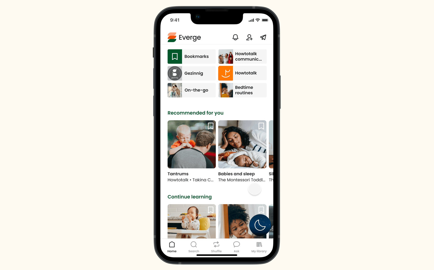
Menu structure
Based on my research, I developed categories and created the first menu structure. I tested this through open card sorting among 8 people.
Through card sorting, I realized that I had to separate ‘about’, ‘support’, ‘subscriptions’ and ‘terms and conditions’ from the setting menu. All 8 testers placed these topics outside the settings menu. This was coherent with my initial interview results. Additionally, people were confused by the term ‘appearance’ during card sorting. To make it more clear, I renamed this ‘dark mode’.

Manage children & interests
In Everge’s onboarding, users are asked to add (their) child(ren) and pick topics they’re interested in. Regarding the question of where to manage this information, testers give mixed answers. 3 out of 8 would do this through their settings, as it is information that you don’t edit often. The other 5 would go to “edit profile” and expect to manage preferences here.
User flow
Time to think about the design of the screens. To do that, we need a user flow. I created a user flow that entails all the screens required by the client and those that seemed relevant according to the user research.
User flow

Iterations
Privacy settings reoccurred throughout my research and testing process.
My research showed that users prefer to set their privacy per collection. Some of their collections they would like to have on their public profile, to influence other users, but others they rather keep to themselves (e.g. content about difficulties they deal with).
Initially, I created a page ‘collection controls’ in the privacy settings. Through user testing and online research, I concluded it would be better to modify these options without going to a settings area.


Design